


 Marketing Intelligence
Mobile First Indexing: What Is It and Why Is It Important?

Remember when desktops ruled the internet? Those days are over. Smartphones and tablets have officially taken over, accounting for more than 60% of global web traffic according to SOAX. And guess what? Google noticed.
Back in 2018, Google rolled out mobile-first indexing, a new update that flipped traditional web indexing on its head. Instead of treating the desktop version of a site as the primary reference, Google now prioritizes the mobile version when crawling and ranking pages. The reason is simple: users expect smooth, fast, and mobile-optimized experiences. If your site isn’t up to par, you’re at risk of slipping down the rankings.
What does this mean for businesses? It’s time to stop treating mobile-friendliness as an afterthought. A clunky, slow, or unresponsive site won’t just frustrate users it’ll cost you visibility. Google’s algorithm rewards sites that load quickly, offer user-friendly navigation, and deliver a top-tier mobile experience.
This change is about keeping up with how people actually use the web. We’ll discuss further about mobile-first indexing, why it matters, and what you need to do.
What is mobile-first indexing?
Think back to the days when desktop was king. That’s how Google originally indexed websites, until mobile took over. Enter Mobile First Indexing, a big change that prioritizes mobile versions of websites for indexing and ranking.
Launched in 2016, Google’s move wasn’t just a minor tweak, it was a response to the fact that mobile browsing had officially overtaken desktop. Instead of using desktop sites as the primary reference, Google now looks at the mobile version first when evaluating a site’s relevance.
So, what does this mean for businesses? Simple: if your mobile site isn’t up to par, your rankings will take a hit. Companies that once tailored their SEO strategies around desktop performance now need a mobile-first mindset to stay competitive.
By July 2019, all new websites defaulted to Mobile First Indexing. This means mobile usability, load speed, and responsive design are no longer just perks but a must. Without them, even the best content could struggle to rank.
Google’s push toward mobile optimization isn’t slowing down. The winners in this change will be those who focus on speed, efficiency, and user-friendly mobile experiences.
Mobile-first indexing SEO: how does it affect you?
Imagine this: You’re searching for a restaurant on your phone, but the site is clunky, slow, and impossible to browse. Frustrating, right? Google thinks so too. That’s why mobile-first indexing is now the standard. If your website isn’t mobile-friendly, it’s already losing ground in search rankings.
So what is the importance of mobile-first indexing? Google’s focus on this has rewritten the rules of SEO, which prioritizes mobile usability over desktop experiences. This means businesses must rethink their strategy, because what works on a desktop won’t cut it on mobile.
Let’s discuss how mobile-first indexing influences SEO:.
SEO adjustments for a mobile-driven strategy
Google’s ranking process now evaluates the mobile version of your site first. That means mobile is the foundation of your SEO strategy and not just an afterthought. If your mobile site is slow, hard to use, or missing important content, you’re at risk of slipping in rankings.
So, what needs to change?
Responsive Design: Your site should adapt seamlessly to any screen size.
Mobile Speed Optimization: Faster loading times improve both user experience and rankings.
User-Friendly Navigation: Simplified menus and touch-friendly buttons matter more than ever.
Revisiting SEO priorities in a mobile environment
Before mobile-first indexing, SEO focused heavily on desktop performance. That’s no longer the case. Google prioritizes mobile usability. That means sites must be optimized for on-the-go users.
Here’s what that looks like:
- Content Accessibility: Text, images, and videos must be easy to view and interact with on mobile.
- Metadata Consistency: Titles, descriptions, and structured data must be matched across desktop and mobile.
- Navigation Clarity: Users should find what they need instantly, without pinching, zooming, or endless scrolling.
Ignoring these factors hurts your rankings, even if your desktop site is flawless. Google’s message is clear: If it’s not optimized for mobile, it’s not optimized at all.
Improving user experience
Mobile-first indexing is all about user experience (UX). Sites that load fast, function smoothly, and feel intuitive are rewarded.
Below are the important areas that you need to improve on:
- Core Web Vitals: Google’s metrics for page speed, interactivity, and visual stability.
- Simplified Layouts: Avoid clutter and prioritize mobile-friendly design.
- Smooth Interactivity: Buttons, forms, and CTAs should be easy to tap, with no tiny links or complex menus.
A poor mobile UX isn’t just an inconvenience for users but also a major ranking killer. Investing in smooth, fast, and user-friendly design is now an SEO must.
Maintaining consistent content and metadata
Google’s mobile-first indexing means the mobile version of your site must mirror the desktop version, down to the smallest detail. Missing content or inconsistent metadata could hurt rankings and user trust.
Here’s what to keep consistent:
- Structured Data: Check that the rich snippets and schema markup are matched across platforms.
- Alt Text & Captions: Keep accessibility features intact on mobile.
- Keyword Optimization: Meta titles and descriptions must remain identical on both versions.
SEO audits are important for identifying gaps in mobile optimization. Google Search Console provides valuable insights into mobile usability issues and traffic trends. Regular audits help maintain visibility and improve mobile rankings.
Effect on e-commerce and local SEO
Mobile-first indexing also has an influence on e-commerce sites. Slow-loading product pages may result in lost sales. Confusing checkout process? That could lead to higher abandonment rates.
Here’s what e-commerce sites need to prioritize:
- Fast-Loading Product Pages: Every second counts, so optimize your images and scripts.
- Mobile-Friendly Checkout: Simplify the process with autofill and easy payment options.
- Enhanced Mobile UX: Make sure that product descriptions and reviews are easy to read and interact with.
For local businesses, mobile-first indexing is even more significant. Most local searches happen on mobile, so local SEO strategies need to adapt:
- Optimized Google Business Profile to appear in mobile searches.
- Mobile-specific keywords for “near me” searches.
- Technical SEO Enhancements like structured data and mobile-responsive layouts.
How to optimize a site for Google’s mobile-first indexing?
With Google prioritizing mobile-friendly content, businesses must fine-tune their strategies to maintain search visibility, improve user experience, and outpace the competition.
This guide walks through necessary steps to align with Google’s mobile-first indexing and make sure your site remains competitive:

Create a mobile-friendly and responsive site
A responsive website is a must. Mobile-first indexing means Google crawls and ranks the mobile version of your site first, so your design must smoothly adapt across devices.
So how do you do it?
- Use a responsive design model that maintains the same HTML code while adapting content for different screen sizes.
- Improve layouts with flexible grids and flexible elements for a smooth transition between desktop and mobile views.
- Implement media queries to control how styles adjust based on device width.
- Verify that interactive elements (buttons, menus, forms) are touch-friendly and don’t break usability on smaller screens.
A well-structured responsive site isn’t just about aesthetics. It promotes user interaction, reduces bounce rates, and signals to Google that your site is mobile-ready.
Want to go a step further?
- Use a Content Delivery Network (CDN) to improve load speeds.
- Optimize images with next-gen formats (WebP, AVIF) for faster rendering.
- Check for domain consistency (m.example.com vs. example.com) to avoid duplicate content issues.
Every adjustment makes your site faster, cleaner, and more mobile-friendly, and that’s exactly what Google wants.
Make sure your site is crawlable and indexable
Even the most visually stunning mobile site won’t rank if Google can’t crawl and index it properly. Checking that search engines can access your content without restrictions is a must for mobile-first indexing.
Here’s how to maximize crawlability:
- Check your robots.txt settings: Make sure that your robots.txt file isn’t blocking important resources (CSS, JavaScript, images) that Google needs to render pages.
- Use the Mobile Usability Report in Google Search Console: This reveals mobile-specific indexing issues that could hurt rankings.
- Refine hreflang tags: If you have localized versions of your site, double-check that your hreflang is set up correctly to prevent duplicate content penalties.
- Avoid noindex tags on important pages: Accidental noindex directives can block mobile pages from appearing in search results.
- Keep meta robots directives consistent: Conflicting desktop and mobile metadata confuses crawlers and leads to indexing errors.
When Google’s crawlers hit roadblocks, your rankings take a hit. Fixing these technical issues removes barriers and strengthens your site’s position in search results.
Perform a site audit to find and fix the technical issues
If you want real information about your site’s performance, you need a thorough site audit. Without it, you’re guessing at what’s holding your rankings back.
An in-depth SEO audit uncovers everything from technical errors to content gaps and performance bottlenecks. Using Similarweb’s Site Audit tool, you can diagnose key issues and improve your mobile-first indexing strategy.
Access the tool by looking for Search Intelligence on the platform and clicking on Site Audit. Then, click on the Go to Site Audit button and select the project for which you’d like to read the report.
Under the SEO Overview, you can check for errors such as status code errors, noindex pages, and site speed issues that could affect Core Web Vitals.
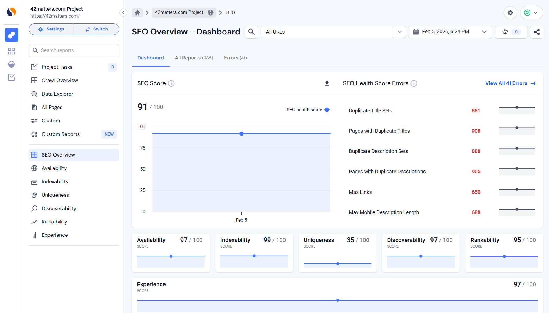
Here’s where to focus to improve your mobile-friendly site:
- Mobile Status Code Errors: The audit pinpoints mobile-specific HTTP status code errors that can mess with user experience or stop search engines from indexing key pages.
- Noindex Pages: The tool highlights which pages are marked ‘noindex.’ Sometimes that’s intentional. Sometimes… not so much. Either way, you get visibility into what content is being hidden from search engines and whether it should be.
- Core Web Vitals (Site Speed): This is where things get serious. Google’s ranking algorithm watches metrics like a hawk (Largest Contentful Paint (LCP), First Input Delay (FID), Cumulative Layout Shift (CLS)). Similarweb’s audit measures them all. Because if your page is slow, jumpy, or laggy on mobile, your rankings will pay for it.
The goal of every audit is to identify weak points, fix errors, and continuously improve your site for Google’s evolving mobile-first expectations.
Search engines are changing and your site needs to keep up
Mobile-first indexing isn’t just another algorithm tweak. It’s a fundamental change in how search engines rank content. With most web traffic now coming from mobile devices, Google and other search engines are prioritizing mobile-friendly sites. If yours isn’t improved, you’re not just losing rankings – you’re losing customers.
This is where Similarweb’s Site Audit comes in. It’s your go-to tool for diagnosing mobile performance issues, from sluggish page speeds to clunky, unresponsive designs. The audit pinpoints exactly what’s holding your site back, so you can fix it ASAP.
The reality? Mobile-first indexing is here to stay. Adapting isn’t optional if you want to stay competitive. With Similarweb’s Site Audit, you don’t have to guess what’s wrong. You get actionable insights to keep your site fast, accessible, and aligned with Google’s evolving standards.
Bottom line: Improve for mobile now, or risk fading from search results. The choice is yours.
FAQs
How does mobile-first indexing change SEO strategies?
Think of it this way: Google now treats the mobile version of your site as the real deal. If your mobile site is slow, clunky, or missing important content, your rankings take a hit. Mobile-first indexing means speed, usability, and content parity between mobile and desktop versions are no longer optional; they’re a must for staying competitive.
What should I do to make my site mobile-first indexing-ready?
The first step is having a responsive design. Your site should adapt seamlessly across devices. The next step is to audit your SEO. Look for technical roadblocks—slow load times, poor navigation, or missing metadata and fix them. The last step is using analytics tools to check that your mobile experience mirrors your desktop version. If your mobile site feels like an afterthought, Google will treat it that way.
How does mobile-first indexing affect local SEO and e-commerce?
E-commerce sites can’t afford a clunky mobile checkout. Mobile-first indexing pushes businesses to refine transaction flows for mobile shoppers. Meanwhile, for local SEO, mobile optimization is important. Users searching “best pizza near me” expect instant, location-based results. A smooth and fast mobile experience can mean the difference between a conversion and a lost customer.

Related Posts


Why AI Engines Cite UGC Over Brand Content And How To Leverage It For AEO

AI Mentions vs. AI Citations: What’s the Difference and Why It Matters for GEO


Track Gen-AI And Organic KPI's On The #1 SEO Platform
Give it a try or talk to our marketing team - it’s free!