






The Top 100 Most Visited Websites in the USA (August 2026)
by Shai Belinsky10 Min.
Sep 29, 2026
In the ever-evolving data analysis landscape, communicating insights effectively is paramount. Raw data – an ocean of numbers and figures – can often feel overwhelming and, let’s face it, sometimes quite dull. However, the right data visualization techniques can breathe life into your findings, transforming complex datasets into engaging stories that resonate with a diverse audience.
Whether you’re a seasoned data scientist, a marketing analyst, or a business executive, mastering these techniques will empower you to make data-driven decisions that propel your organization forward.
In this post, we’ll explore 11 essential data visualization techniques to improve your data presentation skills and help you convey your insights with clarity and impact.
Why do you need to care about picking the right technique? Imagine trying to hammer a tiny nail with a sledgehammer—it’s overkill, right? The same goes for data visualization.
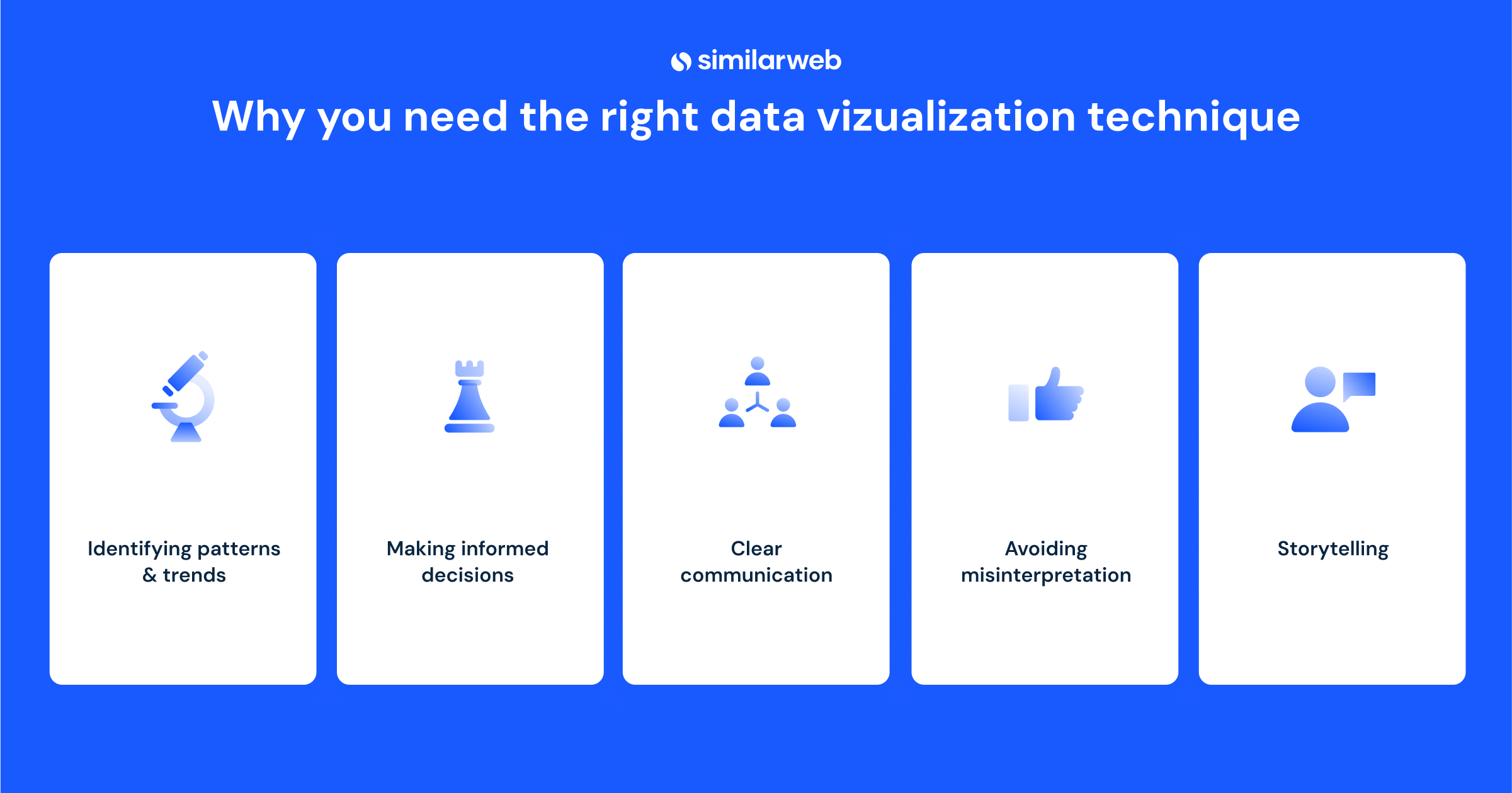
The right technique doesn’t just make your data look pretty; it makes it clear, actionable, and easier to understand, enabling you to make data-driven decisions.
Here’s why it matters:
Ready to make your data shine? Here’s a look at some key data visualization techniques:
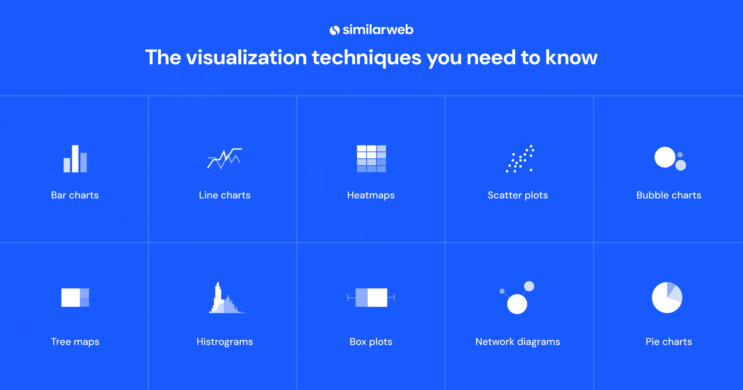
Bar charts are one of the most common. They’re the bread and butter of data visualization. They’re perfect for comparing different categories, such as sales by region or marketing channel performance. The data is depicted on a graph with rectangles proportionate to the actual value. Bar charts make patterns pop, making it easy to spot the winners and the laggards at a glance.
The line chart is brilliant for showing trends over time. This chart type’s advantage is that it connects individual data points to show changes over time. It’s perfect for tracking website traffic, sales growth, or stock market fluctuations.
Heatmaps use color gradients to highlight increasing and decreasing values, making it easy to spot patterns and outliers. They’re ideal for geographical analyses, such as customer density and sales territories or website behavior, which can equate to consumer demand or the lack thereof, revealing insights that might otherwise be missed.
When you want to show the relationship between two variables, scatter plots have your back. The data is shown as a set of data points, each associated with an X and Y value plotted on an X-Y axis. Usually used in scientific and market research, they’re fantastic for identifying correlations, clusters, or outliers, such as how marketing spend influences sales revenue.
Bubble charts take scatter plots up a notch. Instead of connecting data points with lines, we give them size to help with visualization. By adding a third variable (or bubble size), you can compare multiple variables simultaneously—perfect for displaying complex data sets with more depth.
A choropleth map uses color gradients to visualize data across geographical areas. Such maps are excellent at revealing regional patterns, such as population density, income distribution, or voting patterns. They are frequently used in public health to show the geographical spread of diseases and in marketing to depict the high concentration of customers.
Treemaps use nested rectangles to represent hierarchical data, with size and color conveying additional information. They’re ideal for breaking down sales performance across different departments.
Want to see data distribution? Histograms are the go-to. They’re perfect for showing frequency distributions like customer age ranges or sales volumes over time. A histogram of a customer base could tell you the age distribution of your customers and suggest marketing strategies to target age brackets.
Box plots summarize a data set by showing its minimum, first quartile, median, third quartile, and maximum. They’re great for spotting outliers and understanding data variability.
Network diagrams show relationships between different entities, making them ideal for illustrating social networks or transportation systems. They provide a visual representation of how elements’ hook’ to each other, allowing the viewer to understand the relationships more deeply.
Simple and effective—when used sparingly. Pie charts are great for showing the proportions of a whole, but avoid using them for data with too many categories. They are particularly good for showing things like budget allocations or survey results.
Now that you know how to best visualize your data, it’s time to take a look at the data itself. Your company’s data is invaluable. It’s what moves your business forward. However, inviting third-party data to the dance integrates additional datasets to deliver show-stopping insights.
With Similarweb’s Data-as-a-Service (DaaS) solution, you can harness billions of data points from across the digital landscape to fuel business growth. Our available tools allow you to blend our data seamlessly into your already existing dashboards and models.
Mastering the right data visualization techniques is the difference between overwhelming your audience with numbers and impressing them with clear, actionable insights. Whether you’re a data wiz or a beginner, these techniques will help you tell stories with your data, making you the star of every meeting.
Ready to make your data shine? Sign up with Similarweb now and experience the power of data visualization for yourself.
How can data visualization aid in making business decisions?
The process of data visualization converts large sets of data into easy-to-understand visuals, making it easier for stakeholders to grasp the main trends at a glance. Ultimately, it enables better informed and faster decisions.
Why is it crucial to choose the right visualization technique?
A good choice of technique maintains the integrity of the data and verifies that it is presented appropriately and legibly. Bad choices can result in data being misinterpreted and misread, while the right visual technique tells the right story.
Can data visualization techniques be applied to big data?
Yes, big data visualization is a powerful way to display large datasets. There are specialized visualization techniques targeted at big data, which help present large data volumes in simpler ways. Heatmaps and network diagrams are good examples. Such ways to visualize big data help actualize insights.
What makes heatmaps useful for visualization?
Color is used in heatmaps to represent the magnitude of data. The more intense the color, the higher the magnitude of the data. We can find patterns and correlations in a complex data set with the help of heatmaps. They are useful in identifying anomalies in a data set. Heatmaps help to understand the shape of the data intuitively.
What is a bubble chart best used for?
A bubble chart is perfect since there are three variables here, and our chart can show them all simultaneously. Two variables are placed on the x and y axes, while the third – size – is shown by bubble size. This type of visualization can be really powerful in multidimensional analysis since it shows data depth.
Photo by Choong Deng Xiang on Unsplash
by Andrea Pash
Senior Content Marketing Manager
Andrea, with her extensive marketing background and 15+ years in finance, pulls insight and crafts content for Stock Intelligence & DaaS at Similarweb. A UC Irvine grad, she's a concert lover and avid traveler.
The Top 100 Most Visited Websites in the USA (August 2026)

Similarweb Named in Forrester's Answer Engine Optimization Technologies Landscape, Q3 2026

Anthropic IPO: What Claude's Web and App Data Show
Harness the power of data with Similarweb’s APIs to drive smarter business decisions
