Landing Page Best Practices: How to Turn Clicks into Customers
In a world of endless scrolling and information overload, landing pages are an important first encounter. You’ve got just a few precious moments to connect with and make an impression on your target audience.
And, we’re all chasing that ‘love at first click’.
Landing pages have the power to instantly charm, engage and inspire action with potential customers. They also provide a fleeting opportunity to show them what your brand is really all about.
Here, with expert input from Yael Klass (Forbes Council Member and Similarweb’s VP of Corporate Marketing), we’ll dive into landing page best practices, exploring how to design and deliver landing pages that get conversions, not just attention.
We’ll even throw in some extra tips on how to uncover high-performing keywords, decode your competitors’ ad strategies, and drive super-targeted traffic to your landing pages using Similarweb’s Digital Marketing Intelligence.
What are landing pages?
Landing pages are standalone web pages that have been created for a particular purpose: to welcome potential customers who have clicked on a link from your PPC ad, email campaign or social media post.
A landing page should be set up to easily funnel a reader through to completing a desired action, like filling out a contact form, downloading a white paper or setting up a discovery call.
It’s harder than ever to cut through the noise online, so your landing page has to be more than just a destination. It must meet your potential customers’ expectations and needs, as well as delight them, to encourage them to engage further with whatever you’re offering.
So, how do you make a good landing page that turns casual viewers into invested customers? Using these best practices for landing pages:
How to design a landing page
Step #1: Enhance user experience
When designing the layout of your landing page, ease and simplicity is the key to a superior user experience.
Aim for fewer distractions, fewer opportunities to confuse or frustrate readers and, crucially, less of their precious time taken up to achieve the desired action. After all, the primary goal of a landing page is conversion.
Landing page design tips:
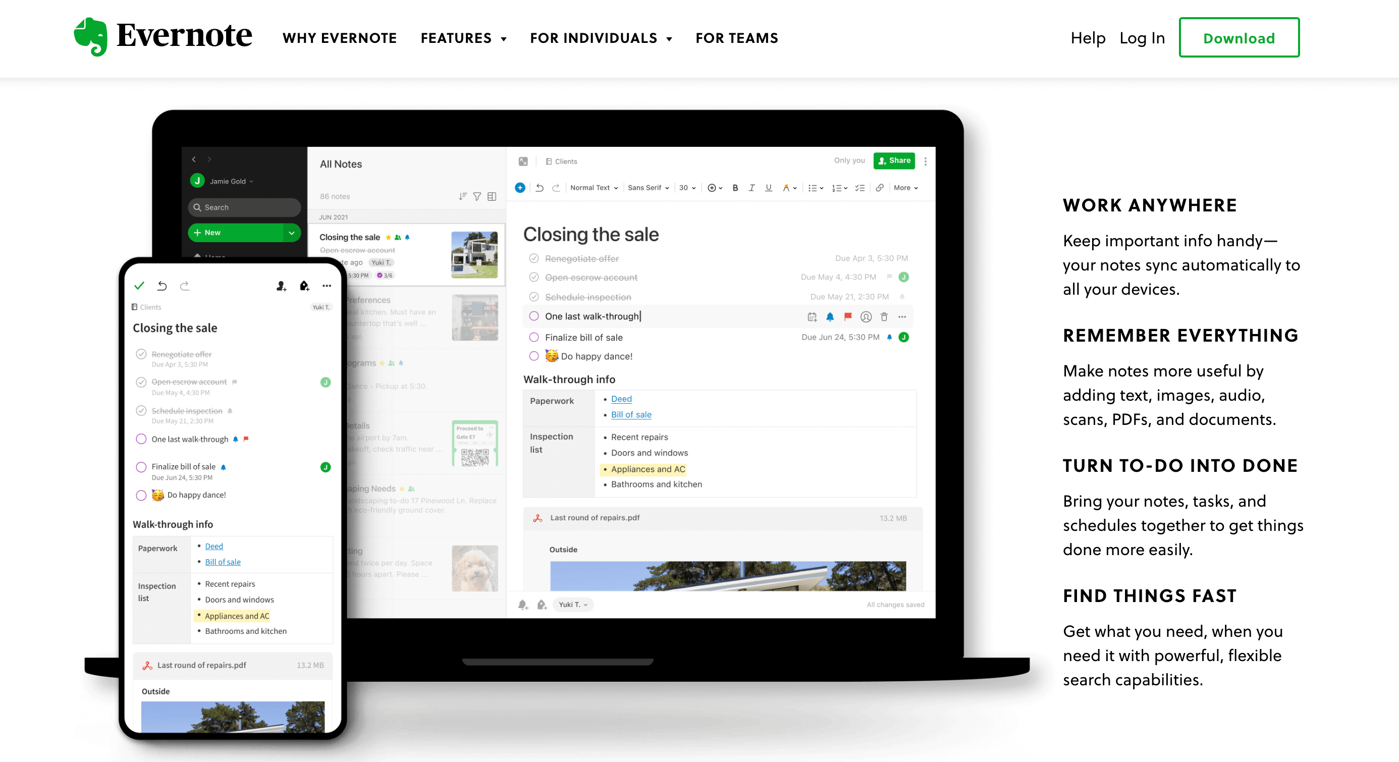
1) Skimmability: A clean, uncluttered design makes it easy for potential customers to quickly scan the page to understand the value of what you’re offering and take the desired action in the blink of an eye.
We love Evernote’s straightforward design here: an image that gives a great snapshot into the product and a few bullet points of the key features
2) A need for speed: A mere 2-second delay in page load time can increase bounce rates by up to 103%. Having fewer design elements on your landing page will help it load faster. So keep it simple, or it’ll cost ya!
3) Cut the navigation: Every additional link on your landing page is a potential exit point. Try removing navigation menus and other irrelevant links to limit the possibility of the user clicking away before converting. Currently, 16% of landing pages don’t have a navigation bar.
4) Mobile first: With a huge proportion of traffic coming from mobile devices, it’s a no brainer to design your landing page with this in mind. In fact, 86% of top landing pages are mobile-friendly.
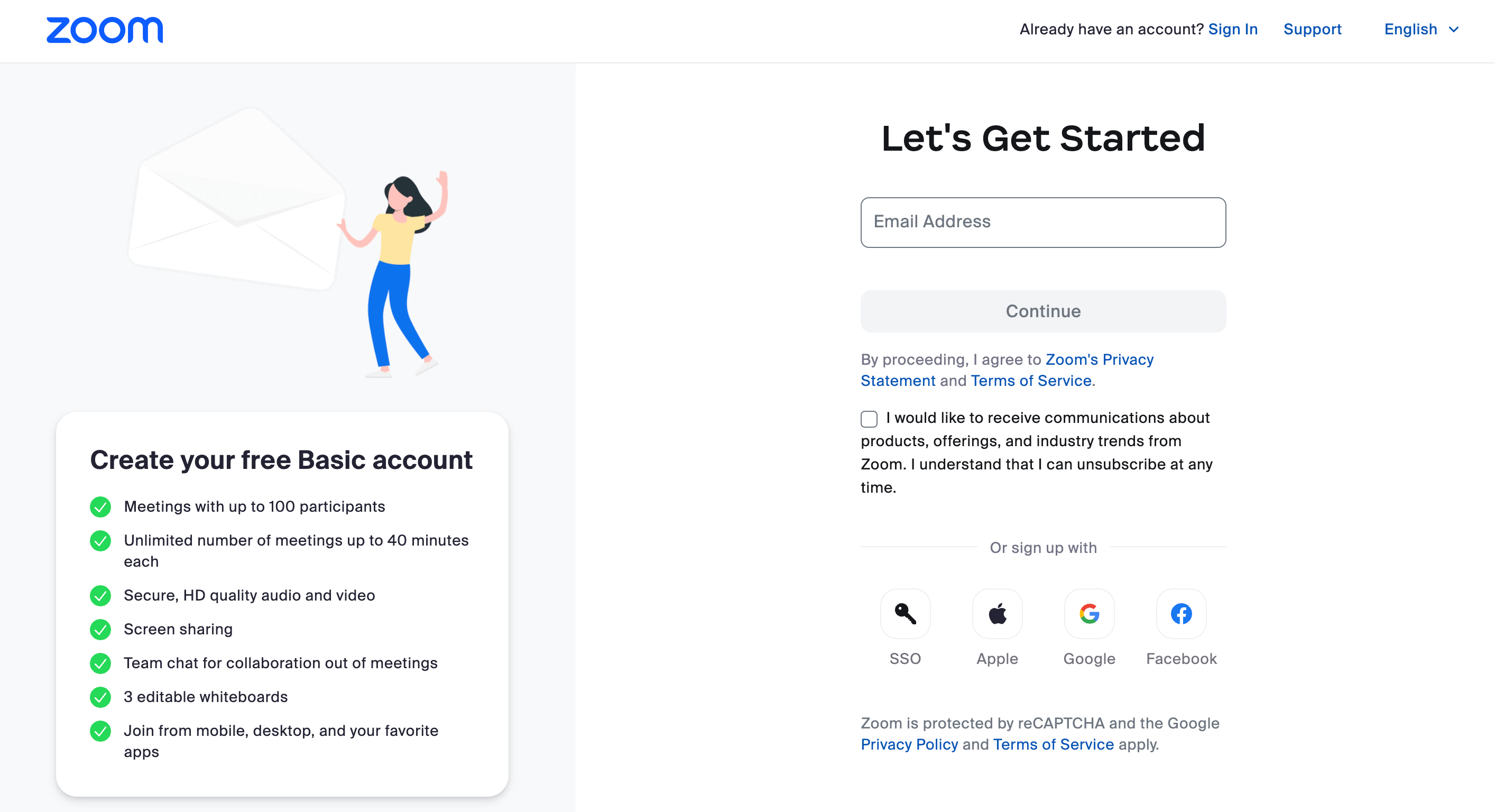
5) Simplicity = submissions: Studies have shown that reducing the number of form fields increases conversion rates as it lowers the barrier to entry. Best practice advises that 3 fields or less is optimal with an average conversion rate of 10%.
This landing page from Zoom takes simplicity to the next level with one form field to kick off the signing up process.
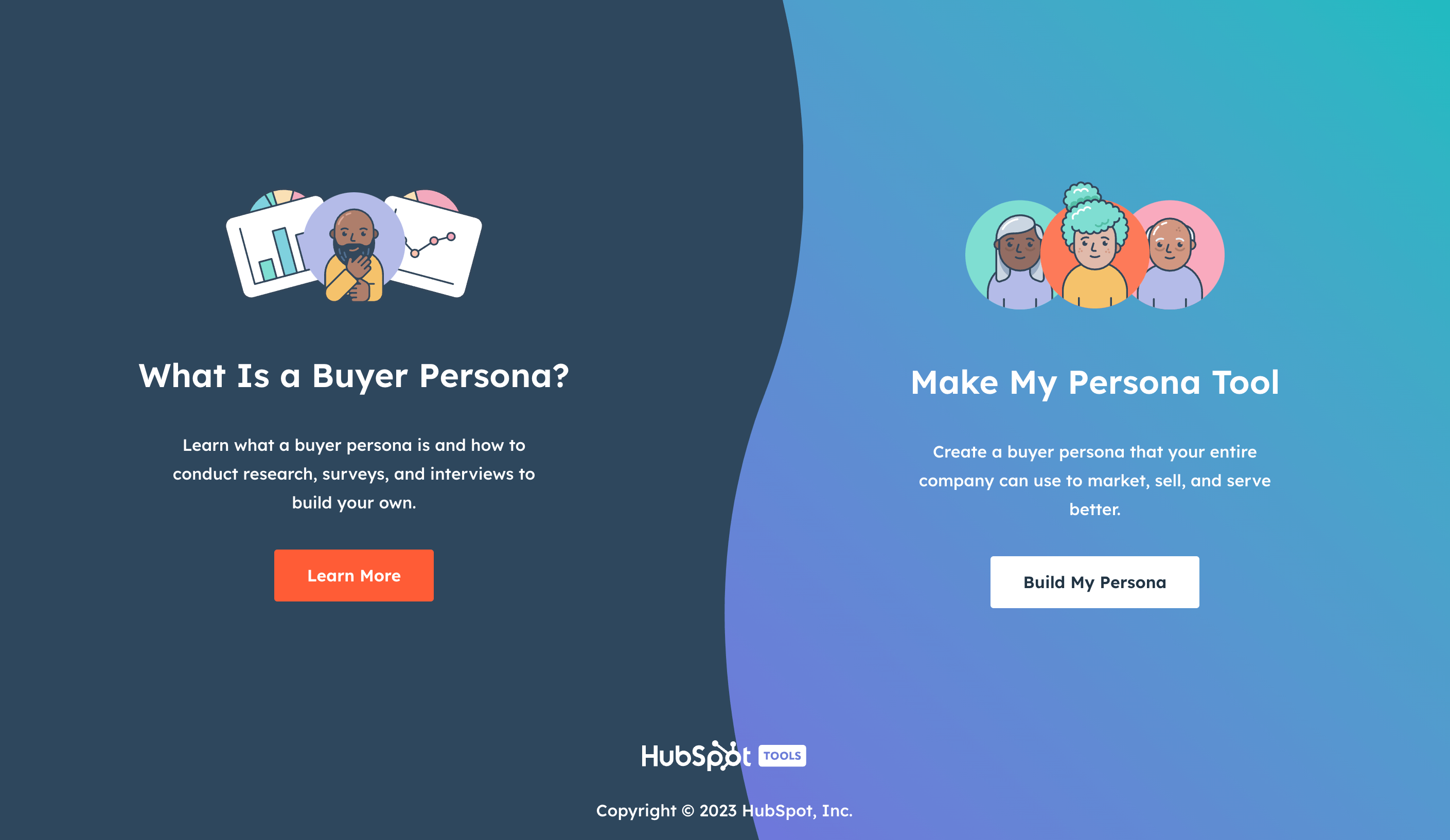
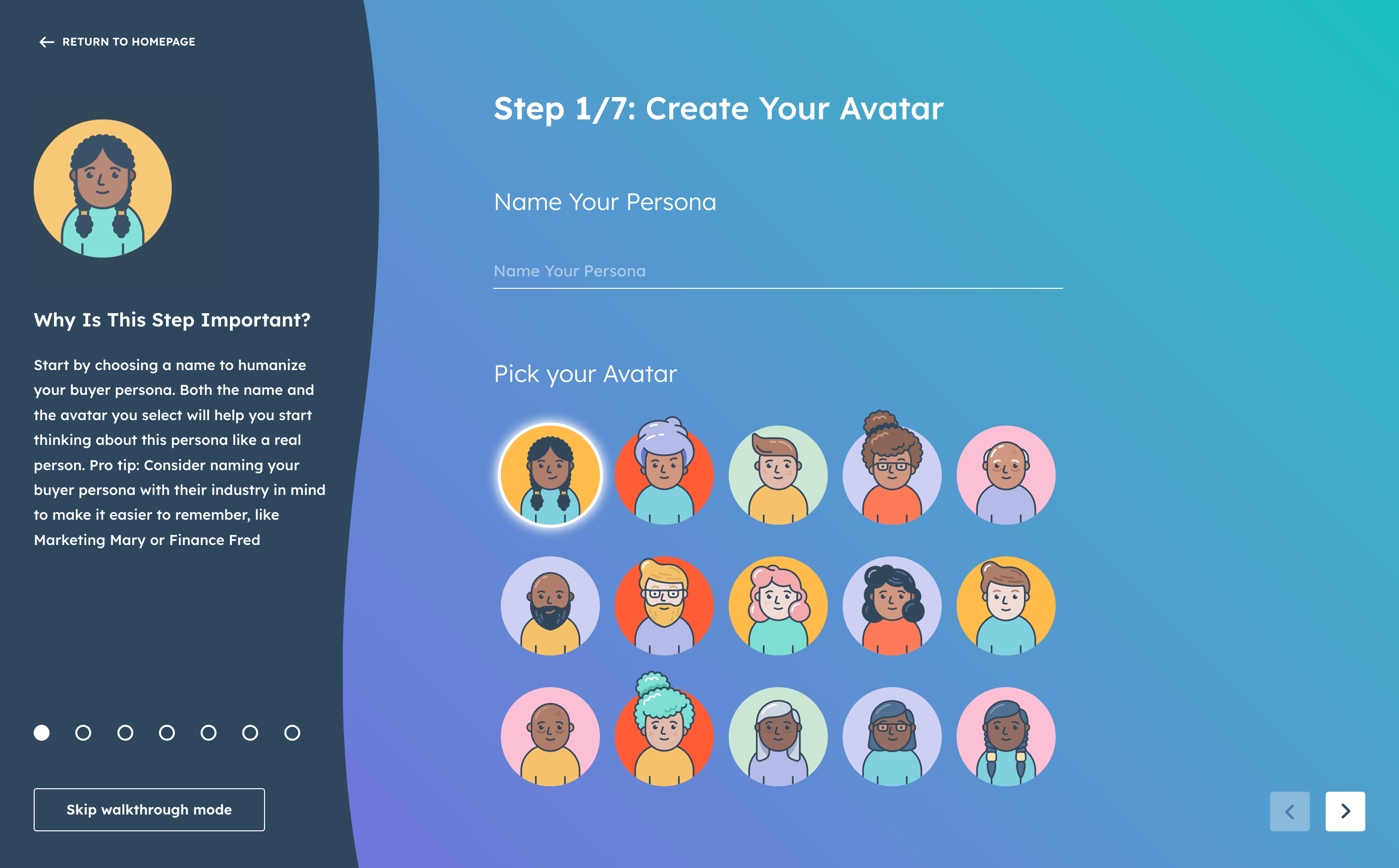
6) Explore interactivity: Simplicity doesn’t necessarily mean boring. If it suits your brand, including more interactivity (like experimenting with an immersive experience) can really capture a user’s attention. Elements that allow the reader to experience your product/service can push them towards a conversion.
This step-by-step, interactive Hubspot landing page gives the user a taste of its Persona tool, showcasing its usefulness, while offering a super fun and unique experience.
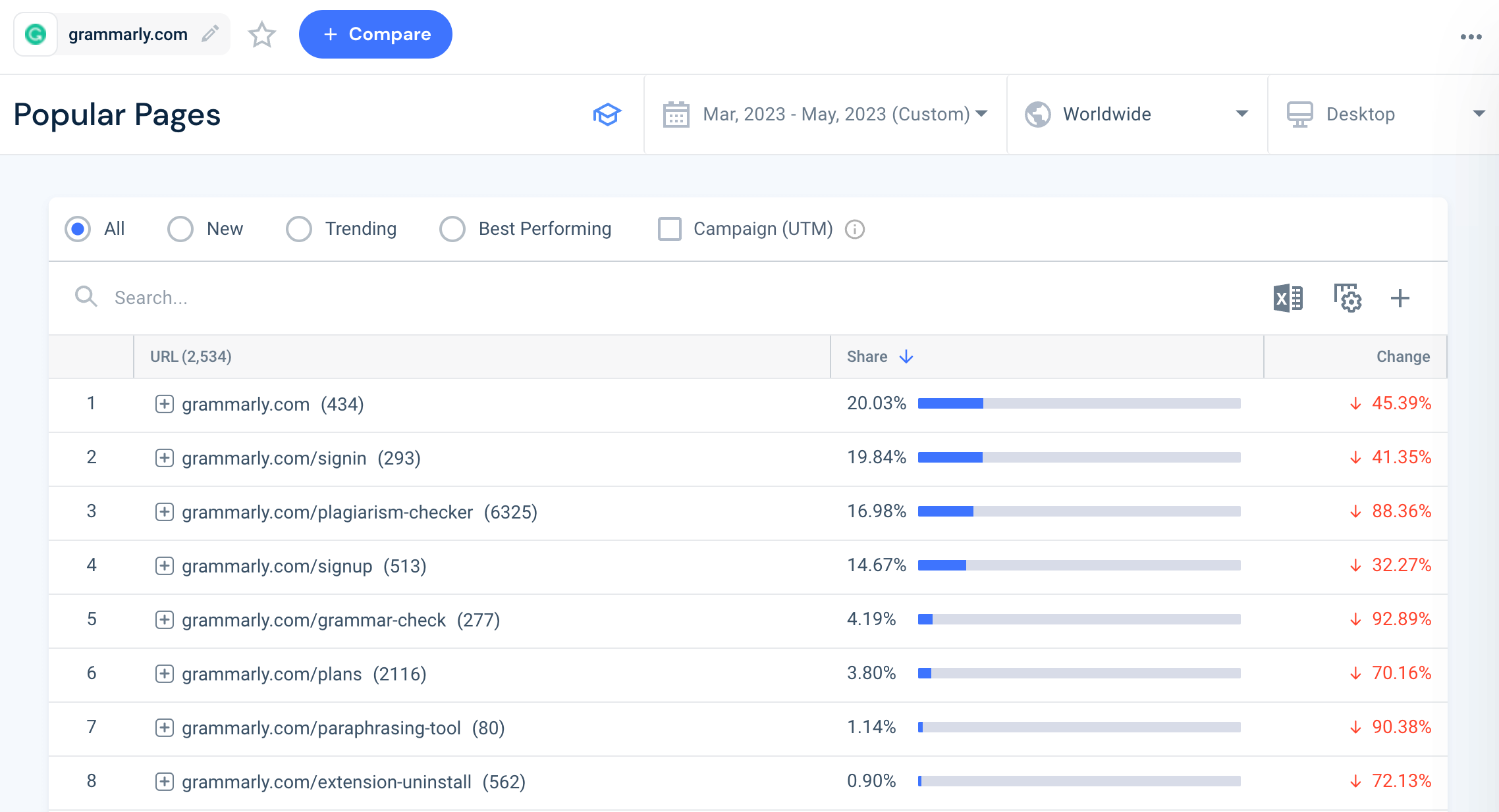
SIDE NOTE: Not to toot our own horn, but all of these amazing landing page examples were found using Similarweb’s Popular Pages feature. It’s a quick and easy way to analyze the engagement of your own pages and those of other websites, helping you uncover the best performing content and keep a tab on changing user preferences.
Step #2: Prioritize visual appeal
Our brains are programmed to process visuals a staggering 60,000 times faster than text, and we all know the saying that a picture is worth a thousand words (or rather 60,000…)
Well, it’s no different for landing pages. If you want to decrease bounce rate and keep potential customers engaged long enough to download that whitepaper or sign up for your webinar, you’ve got to prioritize how everything looks first.
Quick fire pointers:
- Keep your best image above the fold
- Think about adding in video content that gives more detail about the product, feature or service. Roughly 50% of online users actively look for videos related to a product before they buy.
- Use white space to include some social proof elements, such as customer testimonials, ratings or some of your clients’ company logos. This helps to instill trust, credibility and confidence in visitors.
Landing page content tips
Now that you’ve got your landing page design down, let’s dive right into some content landing pages best practices.
Landing Page Tip #1: Relevance reigns supreme
When a user clicks through to your landing page, they expect to immediately see information that aligns to what, just seconds ago, piqued their interest from an ad.
You’ve got only a few crucial seconds to hold their interest beyond that first click, so, the content on your landing page has to be:
1) Relevant to the ad, email or social media post they just clicked
2) Relevant to whatever pain point you’re trying to solve
3) Relevant to the stage in the buyer’s journey
4) Relevant to the specific product/service you’re promoting
A few examples of how to do this:
- Align your headline and subheadings to echo whatever promise you made on your ad, email or instagram post. Include some of the keywords associated with the PPC ad in the landing page’s H1 and subheadings
- Ensure the tone of voice and messaging match to indicate the user is in the right place
- Avoid a ‘one-size-fits all’ approach – many marketers use one general landing page for multiple campaigns (a huge percentage just ship users directly to their homepage.) Instead, create separate, targeted landing pages per product, feature or service. You could even tailor some to suit different marketing channels
Landing Page Tip #2: It’s all about CTAs
CTAs are important gateways between a potential customer and a conversion. They’re like points on a map that guide a user through the landing page to the desired outcome (AKA the final CTA.)
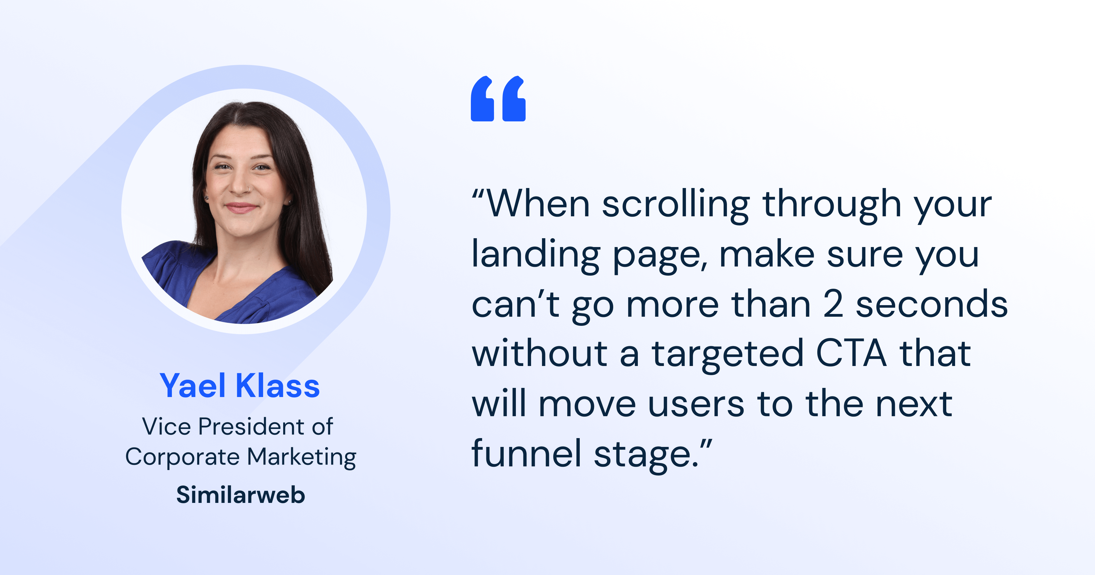
Similarweb’s Yael Klass, is passionate about the power of CTAs, offering sage advice on how best to leverage them on a landing page:
You need to give your target audience enough opportunities to find out more, book a demo, sign up for the newsletter, or download the whitepaper; whatever it is that you’re aiming for.
The trick is strategizing which type of CTA to choose (button, pop-up, text etc.), where to place them and, of course, which messaging will best guide the user rather than overwhelm them.
This is particularly useful when you consider not every user that lands on the page is at the same stage of the buyer journey. One could be at the awareness stage and simply want to watch a feature-focused video or click a ‘Learn More’ button. Another could be further along and close to making a decision, so ‘Buy Now’ or ‘Book a Demo’ CTAs could be more effective.
Having multiple CTAs strategically placed gives you the opportunity to reinforce the desired action as the user navigates through the page.
Top Tip: Get the balance right. Too many CTAs can overwhelm or confuse a user, getting in the way of their decision making or ability to move to the next step.
Test, test, test!
The final step is perfecting your landing page with continuous testing and monitoring over time.
Let’s talk about A/B testing for a moment. You can use this method to create different versions of your landing page, each featuring a different layout, set of visuals, form or copy length to see which your target audience engages with more.
Consider changing one thing at a time, as it will be easier to pin-point which variant drives more conversion. And, with every tweak, ask yourself: is this change making it easier for a user to convert and/or enhancing the overall user experience? This will help you keep you focused on the main goal.
Top Tip: Only 17% of digital marketers currently use A/B testing for landing pages so use this to your advantage to drive more engagement than your competitors!
Similarweb’s bonus landing page tips:
Landing Page Tip #1 Lighten the mood
Yael Klass wholeheartedly believes in the power of humor to win the hearts and minds of an audience:
“Here at Similarweb, we live by the unofficial rule to never publish without a ‘smile per page’. Whether it’s a light joke, witty one-liner or funny image, injecting a bit of humor can turn your landing page experience into something truly memorable.”
Here’s why Yael’s absolutely right, humor:
- Humanizes your brand: With so much impersonal information out there, a dash of humor brings personality to your brand, making it more relatable and human
- Increases stickiness: You can’t argue that humor gets attention. Make your audience laugh and they’re more likely to stay on the page
- Encourages sharing: People like to share laughs, so create something funny and users will be more likely to share with others, increasing your reach
- Aids decision-making: Deciding to buy something can be stressful, so a touch of humor will go a long way in reducing some of that anxiety
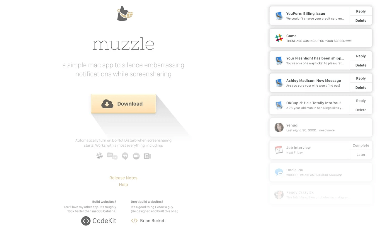
We love this example from Muzzle. Just look at those pop-up notifications!
Landing Page Tip #2 Create templates
Here, Yael shares her thoughts on the value of templatizing:
“At Similarweb, we’ve found that creating landing page templates that use data-driven, tried and tested frameworks is the key to speedy delivery while achieving great conversion rates”
A series of landing pages that are strategically designed to convert from the onset? Um, yes please!
Take a leaf out of Similarweb’s book and start gathering your learnings from A/B testing to create your very own series of landing page templates. They can feature the visuals, content placement/length and CTA types that drive the most conversions with your target audience.
Also, with no need to start from scratch each time and much less back-and-forth with iterations, you’ll quickly and effortlessly craft landing pages that engage and convert.
Landing Page Tip #3 Optimize with Similarweb
Building a great landing page is only part of the puzzle. How you get people there is another important piece. Here are just a few ways that Similarweb’s platform can help you:
1) Get more eyes on your landing page
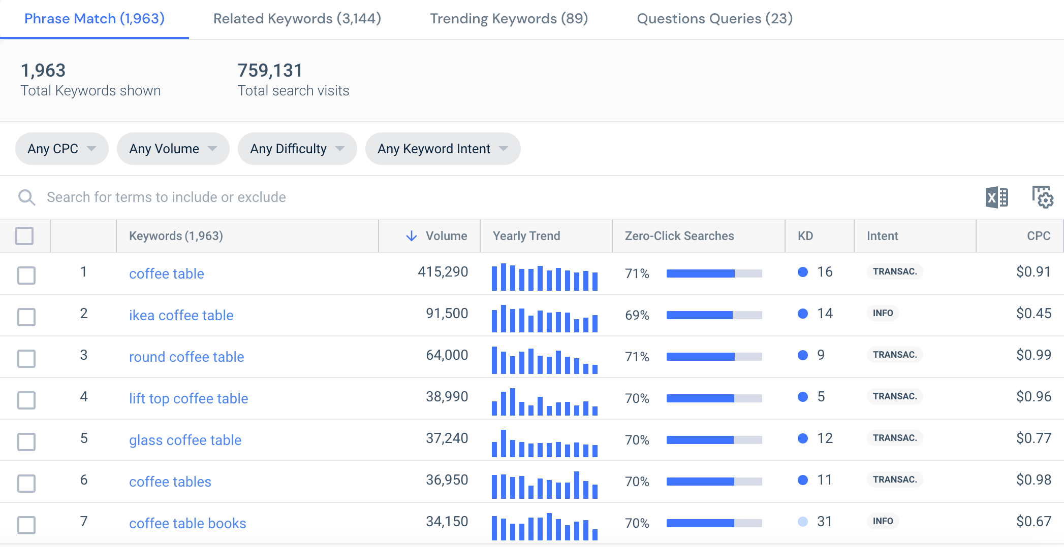
Using Similarweb’s Keyword Generator Tool, discover the keywords that users are actively searching for in relation to the product or service on the landing page. As seen above, enter in a few broad keywords to unearth a goldmine of relevant keywords to use to optimize your content.
You can also use the Keyword Generator to find long-tail keywords. Despite having lower search volumes, these often increase conversion rates due to their specific nature, which tend to align more precisely with what the user is searching.
This leads us on to how to use Similarweb to filter keywords by user intent. To get your landing page more conversions, your best bet is to focus on more transactional keywords as these signal that the user is ready to buy.
2) Create more targeted ads
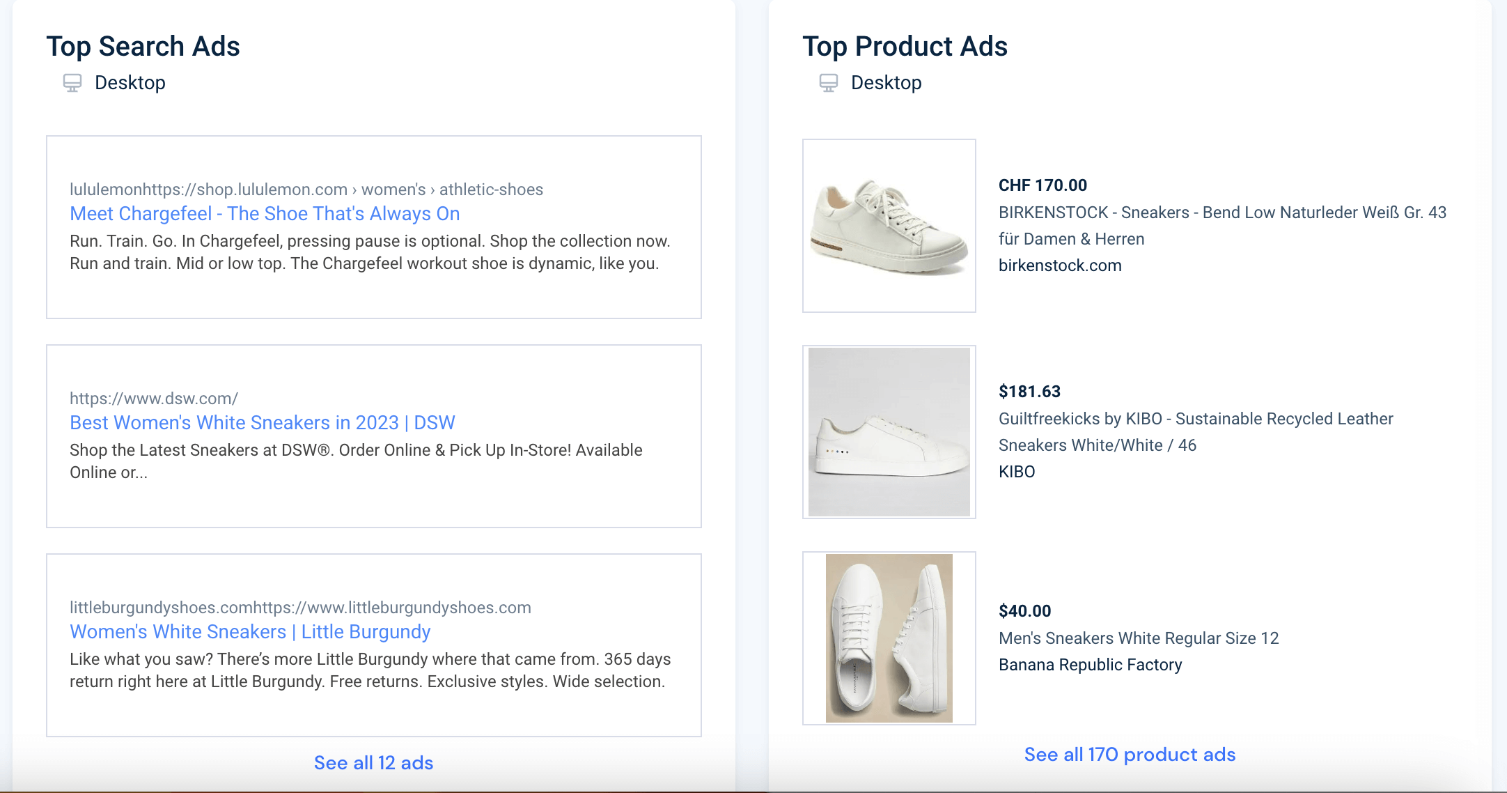
With Similarweb’s Paid Search feature, you can gain an insider’s view into your competitors’ PPC strategies, including the keywords they are targeting and which of their ads are most successful.
By analyzing their approach to keyword and ad strategy, improve your own PPC keyword research and ad campaigns to drive more users to your landing pages.
Using the Keyword Analysis tool, get some inspiration from the best-performing ads to refine your own ad copy. Look at their headlines, CTAs, and messaging angles to get a better idea of what resonates with your audience and drives them to click through to a landing page.
A closing note on landing page best practices
When building landing pages, it’s important to remember that they’re not merely destinations but experiences for potential customers. Here, we’ve given you the most impactful landing page tips to maximize these opportunities to encourage users to convert, and ideally, begin a long-term relationship with your brand.
In a nutshell, how to build a great landing page comes down to prioritizing an uncomplicated design, using compelling visuals, writing super relevant content and including clear and consistent CTAs. Don’t forget – a few magical finishing touches, like a splash of humor, can really help you stand out from the crowd ✨.
Happy designing!
FAQs
What are landing pages in digital marketing?
A landing page is a standalone webpage and is where a visitor “lands” after they click on a link from an email, ad, or social media post. The primary purpose of a landing page is to convert visitors into leads by prompting them to complete a certain action, like filling out a form, signing up for a newsletter, or purchasing a product.
What are some landing page design best practices?
Opt for a simple, uncluttered layout that guides users to the desired action. Make sure your page loads quickly to reduce bounce rates. Prioritize mobile-first design, considering many users visit from mobile devices. Use engaging visuals to capture attention and communicate your message effectively. Incorporate interactive elements to boost user engagement.
What are some landing page content best practices?
Ensure your content is relevant, aligning with the source that brought the visitor to your page. Keep your writing clear and concise, highlighting your value proposition effectively. Craft compelling CTAs that motivate visitors to act. If possible, personalize your content to better resonate with visitors.
Why is testing landing pages important?
Testing is essential for landing page optimization because it helps you understand what works best with your target audience. Methods like A/B testing allow you to compare different versions of your landing page to see which elements, such as the layout, visuals, form, or copy length, are most effective at driving conversions. Continuous testing and refinement based on user behavior data ensures that your landing page remains effective over time.
The #1 PPC tool - get started
Give it a try or talk to our marketing team — don’t worry, it’s free!


